Quickstart
Have Data. Want to make chart.
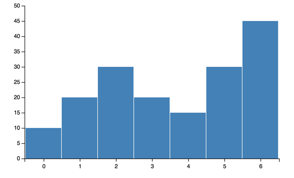
Axis Labels
Labeling the axes is simple:
bar = vincent.Bar(multi_iter1['y1'])
bar.axis_titles(x='Index', y='Value')
You can also control aspects of the layout:
import vincent
from vincent import AxisProperties, PropertySet, ValueRef
bar = vincent.Bar(multi_iter1['y1'])
bar.axis_titles(x='Index', y='Value')
#rotate x axis labels
ax = AxisProperties(
         labels = PropertySet(angle=ValueRef(value=90)))
bar.axes[0].properties = ax
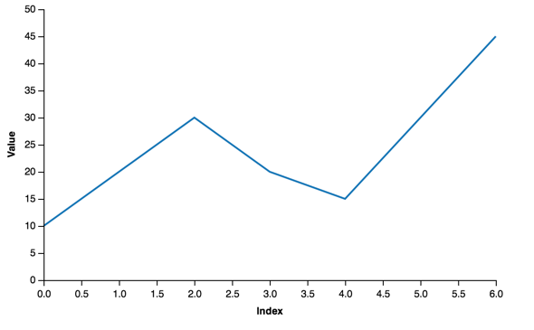
Legends
Most plots create a separate set of scales that allow for categorical legends that are generated automatically. Adding the legend is straightforward:
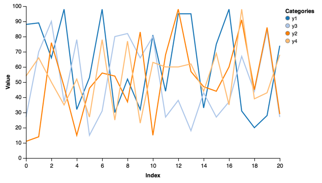
line = vincent.Line(multi_iter1, iter_idx='index')
line.axis_titles(x='Index', y='Value')
line.legend(title='Categories')
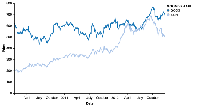
Using the stocks data:
line = vincent.Line(price[['GOOG', 'AAPL']])
line.axis_titles(x='Date', y='Price')
line.legend(title='GOOG vs AAPL')
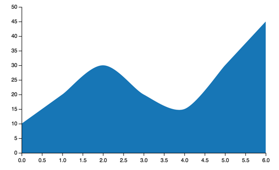
Scatter
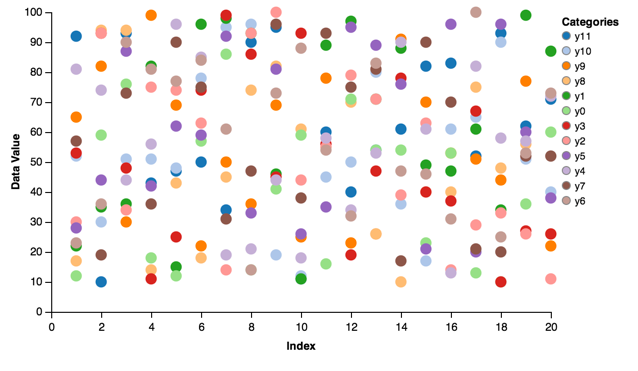
Scatter charts:
scatter = vincent.Scatter(multi_iter2, iter_idx='index')
scatter.axis_titles(x='Index', y='Data Value')
scatter.legend(title='Categories')
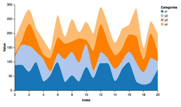
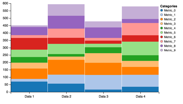
Stacked Area
Stacked areas allow you to visualize multiple categories with one chart:
stacked = vincent.StackedArea(multi_iter1, iter_idx='index')
stacked.axis_titles(x='Index', y='Value')
stacked.legend(title='Categories')
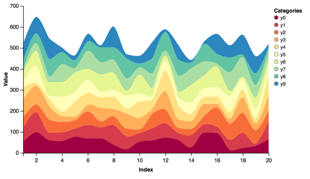
More categories, more colors:
stacked = vincent.StackedArea(df_1)
stacked.axis_titles(x='Index', y='Value')
stacked.legend(title='Categories')
stacked.colors(brew='Spectral')
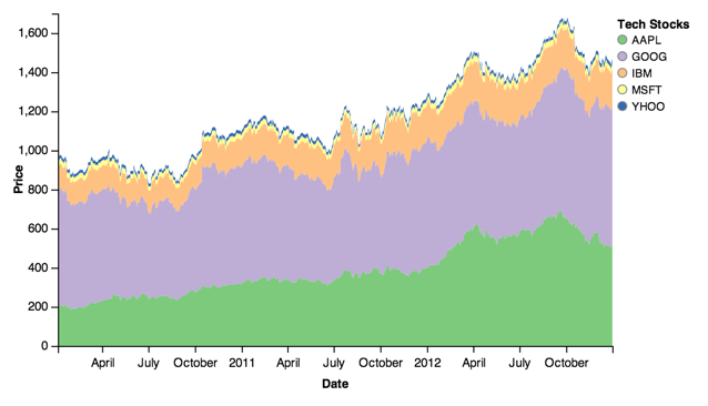
Stocks data:
stacked = vincent.StackedArea(price)
stacked.axis_titles(x='Date', y='Price')
stacked.legend(title='Tech Stocks')
stacked.colors(brew='Accent')
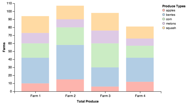
Stacked Bar
Similar to stacked areas, stacked bars let you visualize multiple ordinal categories and groups:
stack = vincent.StackedBar(df_2)
stack.legend(title='Categories')
Adding some bar padding is often helpful:
stack = vincent.StackedBar(df_farm)
stack.axis_titles(x='Total Produce', y='Farms')
stack.legend(title='Produce Types')
stack.scales['x'].padding = 0.2
stack.colors(brew='Pastel1')
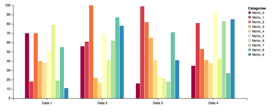
Grouped Bar
Grouped bars are another way to view grouped ordinal data:
group = vincent.GroupedBar(df_2)
group.legend(title='Categories')
group.colors(brew='Spectral')
group.width=750
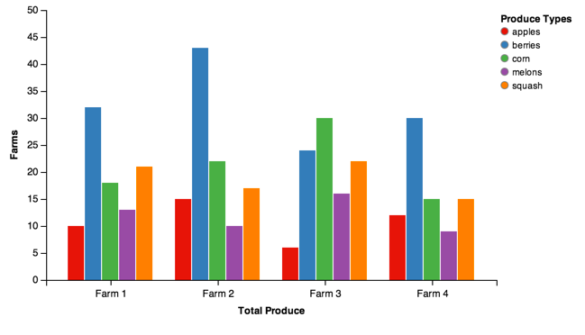
Farm data:
group = vincent.GroupedBar(df_farm)
group.axis_titles(x='Total Produce', y='Farms')
group.legend(title='Produce Types')
group.colors(brew='Set1')
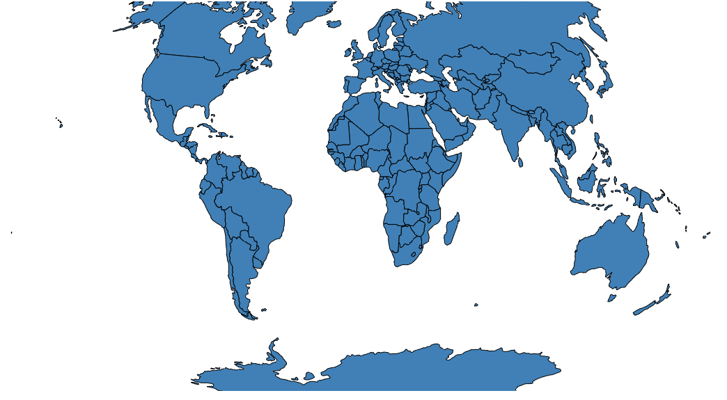
Simple Map
You can find all of the TopoJSON data in the vincent_map_data repo.
A simple world map:
world_topo = r'world-countries.topo.json'
geo_data = [{'name': 'countries',
             'url': world_topo,
             'feature': 'world-countries'}]

vis = vincent.Map(geo_data=geo_data, scale=200)
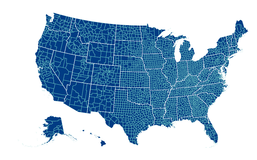
You can also pass multiple map layers:
geo_data = [{'name': 'counties',
             'url': county_topo,
             'feature': 'us_counties.geo'},
            {'name': 'states',
             'url': state_topo,
             'feature': 'us_states.geo'}]

vis = vincent.Map(geo_data=geo_data, scale=1000, projection='albersUsa')
del vis.marks[1].properties.update
vis.marks[0].properties.update.fill.value = '#084081'
vis.marks[1].properties.enter.stroke.value = '#fff'
vis.marks[0].properties.enter.stroke.value = '#7bccc4'
Map Data Binding
Maps can be bound to data via Pandas DataFrames to create Choropleths:
geo_data = [{'name': 'counties',
             'url': county_topo,
             'feature': 'us_counties.geo'}]

vis = vincent.Map(data=merged, geo_data=geo_data, scale=1100, projection='albersUsa',
          data_bind='Employed_2011', data_key='FIPS',
          map_key={'counties': 'properties.FIPS'})
vis.marks[0].properties.enter.stroke_opacity = ValueRef(value=0.5)
vis.to_json('vega.json')
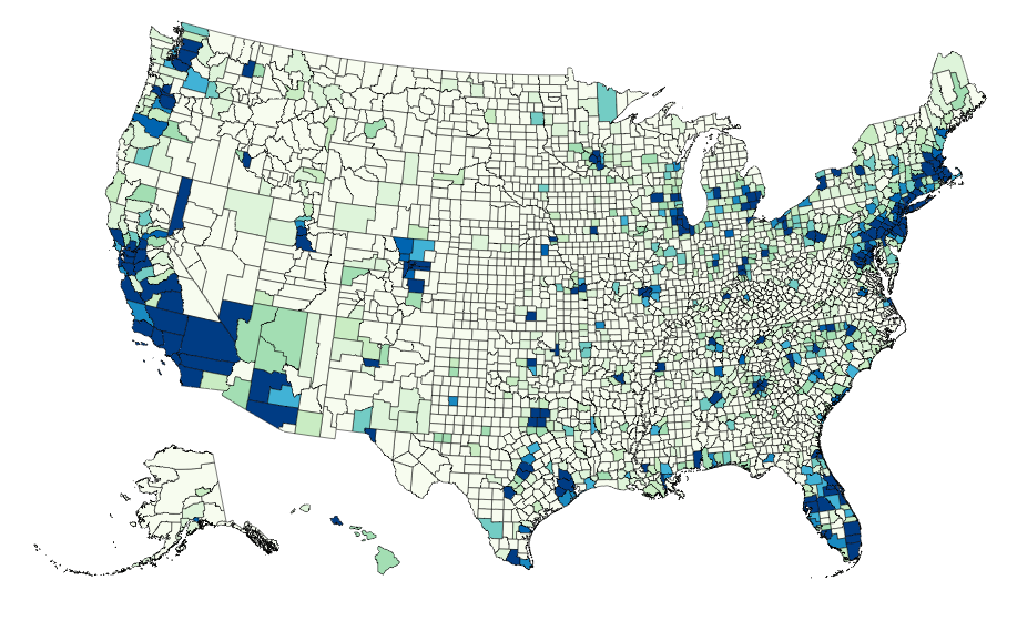
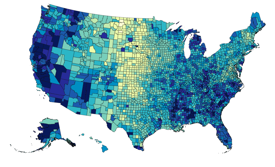
The data can be rebound for new columns with different color brewer scales on the fly:
vis.rebind(column='Unemployment_rate_2011', brew='YlGnBu')
vis.to_json('vega.json')
Output
To write the Vega spec to JSON, use the to_json method:
bar.to_json('bar.json')
If no path is included, it writes it as a string to the REPL:
>>>bar.to_json()
#Really long string of JSON
A simple HTML template to read and display the chart is built-in to Vincent, and can be output along with the JSON:
>>>bar.to_json('bar.json', html_out=True, html_path='bar_template.html')
The HTML will need to be served somehow- luckily, Python makes this easy. Start a simple HTTP Server, then point your browser to localhost:8000:
$python -m SimpleHTTPServer 8000
IPython integration
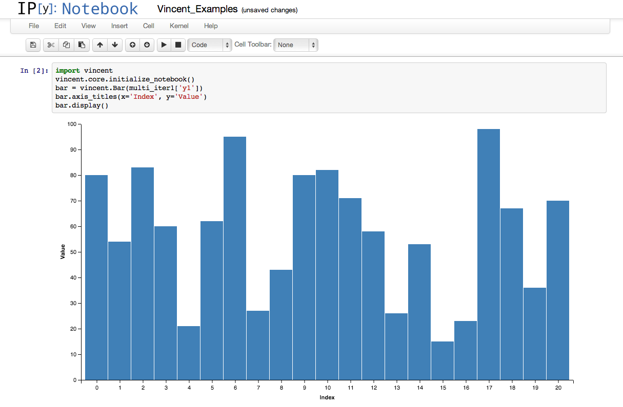
It is possible to run the above examples inside IPython notebook by adding a few extra lines:
import vincent
vincent.core.initialize_notebook()

bar = vincent.Bar(multi_iter1['y1'])
bar.axis_titles(x='Index', y='Value')
bar.display()
Data
These are the datasets used in the Quickstart charts above:
import pandas as pd
import random

#Iterable
list_data = [10, 20, 30, 20, 15, 30, 45]

#Dicts of iterables
cat_1 = ['y1', 'y2', 'y3', 'y4']
index_1 = range(0, 21, 1)
multi_iter1 = {'index': index_1}
for cat in cat_1:
    multi_iter1[cat] = [random.randint(10, 100) for x in index_1]

cat_2 = ['y' + str(x) for x in range(0, 10, 1)]
index_2 = range(1, 21, 1)
multi_iter2 = {'index': index_2}
for cat in cat_2:
    multi_iter2[cat] = [random.randint(10, 100) for x in index_2]

#Pandas
import pandas as pd

farm_1 = {'apples': 10, 'berries': 32, 'squash': 21, 'melons': 13, 'corn': 18}
farm_2 = {'apples': 15, 'berries': 43, 'squash': 17, 'melons': 10, 'corn': 22}
farm_3 = {'apples': 6, 'berries': 24, 'squash': 22, 'melons': 16, 'corn': 30}
farm_4 = {'apples': 12, 'berries': 30, 'squash': 15, 'melons': 9, 'corn': 15}

farm_data = [farm_1, farm_2, farm_3, farm_4]
farm_index = ['Farm 1', 'Farm 2', 'Farm 3', 'Farm 4']
df_farm = pd.DataFrame(farm_data, index=farm_index)

#As DataFrames
index_3 = multi_iter2.pop('index')
df_1 = pd.DataFrame(multi_iter2, index=index_3)
df_1 = df_1.reindex(columns=sorted(df_1.columns))

cat_4 = ['Metric_' + str(x) for x in range(0, 10, 1)]
index_4 = ['Data 1', 'Data 2', 'Data 3', 'Data 4']
data_3 = {}
for cat in cat_4:
    data_3[cat] = [random.randint(10, 100) for x in index_4]
df_2 = pd.DataFrame(data_3, index=index_4)

import pandas.io.data as web
all_data = {}
for ticker in ['AAPL', 'GOOG', 'IBM', 'YHOO', 'MSFT']:
    all_data[ticker] = web.get_data_yahoo(ticker, '1/1/2010', '1/1/2013')
price = pd.DataFrame({tic: data['Adj Close']
                      for tic, data in all_data.iteritems()})

#Map Data Binding
import json
import pandas as pd
#Map the county codes we have in our geometry to those in the
#county_data file, which contains additional rows we don't need
with open('us_counties.topo.json', 'r') as f:
    get_id = json.load(f)

#A little FIPS code munging
new_geoms = []
for geom in get_id['objects']['us_counties.geo']['geometries']:
    geom['properties']['FIPS'] = int(geom['properties']['FIPS'])
    new_geoms.append(geom)

get_id['objects']['us_counties.geo']['geometries'] = new_geoms

with open('us_counties.topo.json', 'w') as f:
    json.dump(get_id, f)

#Grab the FIPS codes and load them into a dataframe
geometries = get_id['objects']['us_counties.geo']['geometries']
county_codes = [x['properties']['FIPS'] for x in geometries]
county_df = pd.DataFrame({'FIPS': county_codes}, dtype=str)
county_df = county_df.astype(int)

#Read into Dataframe, cast to string for consistency
df = pd.read_csv('data/us_county_data.csv', na_values=[' '])
df['FIPS_Code'] = df['FIPS'].astype(str)

#Perform an inner join, pad NA's with data from nearest county
merged = pd.merge(df, county_df, on='FIPS', how='inner')
merged = merged.fillna(method='pad')